Data Visualization
The effort to understand data by placing it in a visual context
Dr. Edward Tufte
- Though leader and practicioner of data visualization
- Written two excellent books on the subject:
- The Visual Display of Quantitative Information
- Envisioning Information
- Put down some principles for data visualization
Excellence in Visualization
- Clear, precise, and efficient communication of complex ideas
- Greatest number of ideas in the smallest amount of time and space
- Multivariate
- Conveys the truth
Visualization Goals
- Content focus
- Comparison rather than description
- Integrity
- High resolution
- Utilize designs proven with time
The Message
- Can use tables, charts, animations, inforgraphics ..etc
- Powerful if the right data and graphic are combined
- We will focus mostly on charts and tables, but know that the possibilities are bigger.
- To improve your visualization, read the work of Stephen Few:
- Show Me the Numbers: Designing Tables and Graphs to Enlighten
- Information Dashboard Design: Displaying Data for At-a-Glance Monitoring
The Message: Charts Vs. Tables
- Tables used to accuratly show the values of specific data points
- Dataframes, frequency tables, balance sheets ...etc
- Charts used to display patterns and comparisons
- Histograms, box plots, scatter plots, bar plots ..etc
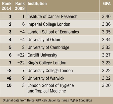
Source: Timer Higher Education

Message Types
- Time series: How values change with time
- Rankings: Categorical subdivisions ordered in ascending or descending order for comparison
- Part-to-whole: Categorical subdivisions to show ratio to the whole
- Deviation: Categorical subdivisions compared to reference (like mean or predicted values)
Message Types Cont.
- Frequency distributions
- Correlations: Comparison between two variables
- Nominal comparisons: Comparison of categorecal subdivisions without a particular order
- Geospatial: Comparison of data across map or layout
The Right Chart for The Message
- See the chart selection matrix by Stephen Few
- View also his presentation on improving charts
- See also selecting the right chart type by Andrew Abela
References and Resources
Tufte, E. R. (2001). The visual display of quantitative information.
Resources for 424 Info Vis. Course at University of Washington By. Prof. Maureen Stone and Prof. Polle Zellweger.
- Tableau public, try it for free
# using altair
import pandas as pd
import altair as alt

# you need a dataset
cars_df = pd.read_json("https://github.com/vega/vega-datasets/raw/gh-pages/data/cars.json")

# you can also load the sample data provided with altair using
# cars_df = alt.load_dataset('cars')
# for list of data sets, run the following command in jupyter:
# alt.datasets.list_datasets()

# Build the chart and configure it
chart = alt.Chart(cars_df).mark_circle().encode(
    x='Horsepower',
    y='Miles_per_Gallon',
    color='Origin',
)

# display it
chart

# Same chart on matplotlib
%matplotlib inline
import matplotlib.pyplot as plt

# use loop to plot each circle in a different color
for (origin), group in cars_df.groupby('Origin'):
    plt.plot(group['Horsepower'], group['Miles_per_Gallon'],
             'o', label=origin)

# set the legend and labels
plt.legend(title='Origin')
plt.xlabel('Horsepower')
plt.ylabel('Miles_per_Gallon');

# enable grid
plt.grid(True)

Altair uses a declarative syntax
- You express the logic of constructing the plot
- Matplotlib uses imperitave syntax where you give specific instructions to construct the plot
- Assumes that the data is in tidy form
- Required reading: Tidy Data, by Hadley Wickham
The Syntax
Chart( data ).mark_type( options ).encode( channels )
   1     2        3         4        5        6

# alternatively you can reverse mark and encode
Chart( data ).encode( channels ).mark_type( options )
Chart( data ).mark_type( options ).encode( channels )
   1     2        3         4        5        6
1- Chart:
Construct a chart object (OOP), can be:
- Chart: Used to display a single chart, our likely use case
- LayeredChart: To place multiple charts on top of one another (When you want to be fancy)
Chart( data ).mark_type( options ).encode( channels )
   1     2        3         4        5        6
2- Data:
Tells Altair what data set to use for the plot, can be:
- Pandas dataframe
- Altair Data object
- URL/filename of json or csv data
- Remember: json must be list of dictionaries (called objects in javascript)
- Use this to keep the size of the notebook small
# url also works
url = 'https://vega.github.io/vega-datasets/data/cars.json'

alt.Chart(url).mark_circle().encode(
    x='Horsepower',
    y='Miles_per_Gallon',
    #color="Origin", # bug, does not work with url
)

Chart( data ).mark_type( options ).encode( channels )
   1     2        3         4        5        6
3- Marks:
Tells Altair how to represent values on the chart, includes:
- mark_line(), mark_area(), mark_round(), mark_bar()
- Can be configured with mark_options
- Unlike pandas, these will mutate the original chart
- Complete list available here
# we can use this command to display multiple charts from a single cell
chart.display()

# let's modify our chart
chart.mark_area() # this mutated chart

# try other mark_* types
chart.display() # this will show the mutated plot

# These are options that affect all the points
chart.mark_square(opacity=0.3, size=100)

Chart( data ).mark_type( options ).encode( channels )
   1     2        3         4        5        6
5- Encode:
- Must be there, tells altair how to plot the values
Chart( data ).mark_type( options ).encode( channels )
   1     2        3         4        5        6
6- Encoding Channels
These are the options to tell altair how to:
- Link data to axis
- Plot the data
- Group/transform the data
These options are referred to as Channels
Most important channel configurations:
- x: Name of column to map to x axis (as a string)
- y: Name of column to map to x axis (as a string)
# plot Displacement vs Cylinders
chart.encode(x="Displacement", y="Cylinders")

# notice how previous options remain if not changed (like color)

# it's better to create a new chart object for new charts
# so that it is not affected by previous changes

alt.Chart(cars_df).mark_circle().encode(x="Displacement", y="Cylinders")

# Notice how values are no longer colored

alt.Chart(cars_df).mark_bar().encode(
    x="Cylinders",
    y="count(*)",)

Aggregation Function in Altair
You can use the following functions to describe the aggregation for the axes values in the following format:
'aggregation(variable)'
Use * in place of variable to mean for any row/observation
The functions include: sum, mean, media, variance, stdev, distinct .. and more
#
alt.Chart(cars_df).mark_bar().encode(
    x="Cylinders:N",
    y="count(*)",)

Column names can describe the datatype
- using : and a letter after the name to describe the type.
- For example:
'sales:Q'tells Altair that the sales column is a quantitative value. - Letter can be:
| Data Type | Letter | Description |
|---|---|---|
| quantitative | Q | a continuous real-valued quantity |
| ordinal | O | a discrete ordered quantity |
| nominal | N | a discrete unordered category |
| temporal | T | a time or date value |
# you can use column or row to split the graphs based on group
# this is called a trellis plot

alt.Chart(cars_df).mark_bar().encode(
    column="Origin",
    x="Cylinders:N",
    y="count(*)",)

Channels With Legends
- These are the channels that produce a legend on the graph.
- Used typically with a categorical grouping variable
- These channel configurations affect individual points on the plot based on its value
- Remember, configuring a mark will affect all points on the plot
- The channels include: color, opacity, size, and shape
alt.Chart(cars_df).mark_bar().encode(
    color="Origin",
    x="Cylinders:N",
    y="count(*)",)

alt.Chart(cars_df).mark_circle().encode(
    color="Origin",
    size="Cylinders",
    x="Miles_per_Gallon",
    y="Horsepower",)

alt.Chart(cars_df).mark_circle().encode(
    color="Origin",
    size="Weight_in_lbs",
    x="Miles_per_Gallon",
    y="Horsepower",)

Notes on Altair
- Data is included with plot, the more plots in the notebook, the greater its size in MB
- Maximum data points are 5000 to miaintain performance, can be increased to 10000 using
cart.max_rows = 10000 - Use chart_display() to display multiple charts from a single cell
- Unlike jupyter, performing methods on chart object will mutate it