Steps In Exploratory Data Analysis
- Problem definition and planning
- Data preperation
- Data analysis
- Deployment
Problem Definition
- Identify the problem to be solved
- Problem to explore? Question to answer? System to build?
- List project deliverables
- Report vs System
- Identify required resources/skills and success factors
- Including data sources
- Assemble team
- Prepare plan
Data Preperation (Longest Step)
- Access and combine data
- Summarize data
- Look for errors
- Transform data
- Segment data
Data Analysis (Uncertain Step)
- Exploring relationships between variables
- Group summaries and comparisons
- Visualization (Our focus)
- Other advanced topics include:
- Discovering non-trivial patterns
- Building regression and classification models
- ... etc
Deployment
- Generate report
- Deploy decision-support tool/system
- Measure business impact
Notes On The Steps
- They apply to any other advanced type of analysis
- Because the process involves discovery, it is iterative
- Experience is key
- Multiple perspective and critical thinking is useful
- Patience and Perseverance is required
Data Visualization
The effort to understand data by placing it in a visual context
Dr. Edward Tufte
- Though leader and practicioner of data visualization
- Written two excellent books on the subject:
- The Visual Display of Quantitative Information
- Envisioning Information
- Put down some principles for data visualization
Excellence in Visualization
- Clear, precise, and efficient communication of complex ideas
- Greatest number of ideas in the smallest amount of time and space
- Multivariate
- Conveys the truth
Visualization Goals
- Content focus
- Comparison rather than description
- Integrity
- High resolution
- Utilize designs proven with time
The Message
- Can use tables, charts, animations, inforgraphics ..etc
- Powerful if the right data and graphic are combined
- We will focus mostly on charts and tables, but know that the possibilities are bigger.
- To improve your visualization, read the work of Stephen Few:
- Show Me the Numbers: Designing Tables and Graphs to Enlighten
- Information Dashboard Design: Displaying Data for At-a-Glance Monitoring
The Visualization Tools - In Python
- Matplotlib (We will work with this)
- Bokeh
- ggplot
- Seaborn (and this)
- Plotly
- Altair
- .. others
They vary in their simplicity and capabilities: static, interactive, animated ..etc.
The Message: Charts Vs. Tables
- Tables used to accuratly show the values of specific data points
- Dataframes, frequency tables, balance sheets ...etc
- Charts used to display patterns and comparisons
- Histograms, box plots, scatter plots, bar plots ..etc
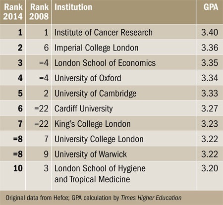
Source: Timer Higher Education

What is a Message?
- It is an insight that you observe in your data
- It includes either a single or multiple variables or subdivisions from your data that convey the insight
The Variables Can Be
- Continuous, e.g.: 1, 1.3, -2, -4, 3.4, 50001
- Discrete, e.g.: 1, 2, 3, 4, 4, -1 (No fractions)
- Ordinal, e.g.: 1,2,1,2,3,3,3,3 (Limited set of descrete numbers, order is meaningful)
- Nominal, e.g.: 1,2,1,2,3,3,3,3 (Limited set of descrete numbers, order is NOT meaningful)
- Categorical, e.g.: Male, Female
Message Types For Charts
- Time series: How values change with time
- Rankings: Categorical subdivisions ordered in ascending or descending order for comparison
- Part-to-whole: Categorical subdivisions to show ratio to the whole
- Deviation: Categorical subdivisions compared to reference (like mean or predicted values)
Message Types For Charts Cont.
- Frequency distributions
- Correlations: Comparison between two variables
- Nominal comparisons: Comparison of categorecal subdivisions without a particular order
- Geospatial: Comparison of data across map or layout
The Right Chart for The Message
- See the chart selection matrix by Stephen Few
- View also his presentation on improving charts
- See also selecting the right chart type by Andrew Abela
References and Resources
Tufte, E. R. (2001). The visual display of quantitative information.
Resources for 424 Info Vis. Course at University of Washington By. Prof. Maureen Stone and Prof. Polle Zellweger.
- Tableau public, try it for free
Our EDA Framework
- Fetch the data
- Examine and understand the data
- Clean the data
- Investigate the data
Fetch the Data
- Loading the data
- Putting the data in table format that we can use our tools to analyze
- Table format is referred to as Data Frame
- Capturing data from the source
- Scrapping, API, or download.
- Will be explored later in the course
Examine and understand the data
- What variables does the dataframe contain?
- How many records?
- Are there problems in the data?
- Missing data, problematic data, ...etc
- Mostly univariate data analysis and summaries
Cleaning The Data
- Steps we take to fix problems that we discovered with data
- Involves:
- Reshaping data
- Dropping data
- Interpolation
- More data collection, either from same source or other sources
- Only start next step when you think you have appropriate data
Investigate The Data
- Goal is to find anomalies and difference, as they signal that something interesting exists.
- Always try to explain what you see
- Think of implications of findings
- Think of followup questions and new data that can inform the investigation
Steps to Investigate The Data
- Start with univariate analysis
- You should have already done this
- Try to explain interesting distributions
- Multivariate analysis
- Examine relationships between the variables that you have
- Perform advanced analysis techniques like clustering and dimensionality reduction
- Subdivisions and groups
- Discover the variables you can subdivide or group your data on, most likely categorical
- Perform Univeariate and multivariate analysis, and compare group plots